Hello, I am Hugo a French student in mechanical and electrical engineering. I have developed an interest in programming and especially data analysis on the side of my studies. This is my portfolio of all my interesting projects regarding this subject ranging from analysis, automations, QOL enhancement or projects in specific industries .
Minimal & ready to use inferential and descriptive statistical tools
Visualization tools for rupture trend analysis in the pharmaceutical industry
Verification tool that ensures the run of the reception process in a warehouse
Add-on for MyUnisoft that displays profitability of accountants and clients on specific tasks and period of time
Automation of internship search, tailoring of resume to save time
Here are the GitHub links to my project! : @Hugo69md/Inferential-Statistics // @Hugo69md/Descriptive-Statistics
A family member of mine who runs their own company needed a way to monitor their business metrics more efficiently. They had very specific requirements for a custom dashboard layout that standard software couldn't provide.
While their business has specific internal rules for how data should be handled and interpreted, the off-the-shelf software they were using was too rigid; it couldn't be programmed to follow their unique logic, forcing them to perform many checks and "tests" manually.
They were looking for a solution that could:
The custom graph maker I developed provides all the specific layout features they need, offering total freedom over how their business data is visualized.
To make it accessible, I ensured that data can be filtered with just a single line of code. Furthermore, for a non-coder, I've made it possible to integrate the ChatGPT API, allowing them to filter and query their data using natural language.
For the data monitoring side, the program automatically runs all the necessary checks according to the company's specific quality policy. The script produces clear, custom visuals and straightforward reports that answer the vital questions: Is the business hitting its targets? If so, by how much? If not, why?
Here are some outputs plots made with the descriptive statistics script. The different color coding for histogram or box plots allows easier visualization of data, the numbers on top of each columns is a feature that is not available on the software my client was working with for scatterplots or lineplots, you can choose to add a regression line to the plot. In the same way, it is possible to apply a hue or not to the distribution plot. Those seemingly small features when added up, allow to be way more efficient for repetitive work.
/==================Normality Test Results==================/
Sample Size: 91
Alpha: 0.05
Method Used: Shapiro-Wilk (Sample size <= 5000)
/==================Sample analysis==================/
Test Statistic sample : 0.9784386609382795
P-Value: 0.13574379655638724
Hypothesis testing for normality test results: H0 accepted, normality test validated
/==================1 sample t-Test Results==================/
Sample Size: 91
Alpha: 0.05
Method Used: 'Student's 1 sample T test
Test Statistic: -1.4006174221594012
P-Value: 0.16476686687917072
Expected Mean: 0.24
Hypothesis testing: H0 accepted, the expected mean correlates to the sample's mean
/============================ Warnings ============================/
//
Here is the output of the 1 sample t-test made with the inferential statistics script. Inferential statistics tests work with assumptions, we have to verify if they are fulfilled in order for the test to be reliable, they tend to vary in between different tests, here it's a normality test that needs to be passed. The program selects automatically the best fitted test of normality for the sample among 3 different ones, here Shapiro-wilk is the best fit and will give the better estimation of normality. The expected mean is 0.18, the sample is normal and the P value is 0.08. H0 is accepted.
/================== Normality Test Results ==================/
Sample Size: 5100
Alpha: 0.06
Method Used: D'Agostino's K-squared (Sample size > 5000 && alpha >= 0,05)
/================== First sample analysis ==================/
Test Statistic first sample : 1.404463028267466
P-Value: 0.4954784021600447
Hypothesis testing for normality test results: H0 accepted, normality test validated
/================== Second sample analysis ==================/
Test Statistic first sample : 3968.7644141368087
P-Value: 0.0
Hypothesis testing for normality test results: H1 accepted, normality test not validated
/================== Equality of Variances Test Results ==================/
Sample Size: 5100
Alpha: 0.06
Method Used: Levene's test
Test Statistic: 3873.156463095762
P-Value: 0.0
Hypothesis testing for equality of variances: H1 accepted, the variances are not equal
/============================ Variance infos ============================/
Sample 1 Variance: 0.972119
Sample 2 Variance: 0.083012
Variance Ratio (larger/smaller): 11.7106
/================== Independant Equality of Means Test Results ==================/
Sample Size: 5100
Alpha: 0.06
Method Used: Welch's T test
Test Statistic: -35.02111619074387
P-Value: 1.5885604446504975e-244
Hypothesis testing for equality of means: H1 accepted, the means are not equal
/============================ Means infos ============================/
Sample 1 Mean: -0.002602
Sample 2 Mean: 0.501129
/============================ Warnings ============================/
!!!!!! the distribution of at least one sample is NOT normal, use a non parametric test
Here is the output of the independent 2 samples t-test or equality of means test made with the inferential statistics script. For this test, each assumptions builds the correct test automatically depending on the results of each precedent test. Here levene's test is used for equality of variances because one of the sample is not normal, the test is more robust than Bartlett's, the other alternative. The test for equality of means is Welch's t test instead of the independent 2 sample t-test because Welch's test is more robust for inequality in variances. A warning appeared stating that one of the sample is not normal, and that the results might not represent reality as the equality of means test is a parametric test.
/================== Normality Test Results ==================/
Sample Size: 5100
Alpha: 0.05
Method Used: Anderson-Darling (samplesize >= 5000 && alpha <= 0,05)
/================== First sample analysis ==================/
Test Statistic first sample : 58.18057606818911
Critical Value accepted: 0.786
Hypothesis testing for normality test results: H1 accepted, normality test not validated
/================== Second sample analysis ==================/
Test Statistic first sample : 53.298295330665496
Critical Value accepted: 0.786
Hypothesis testing for normality test results: H1 accepted, normality test not validated
/================== Distribution Shape Check for Mann-Whitney U ==================/
Sample Names: Uniform vs RandomIntegers
Sample Sizes: 5100
Alpha Level (informal): 0.05
Comparison Tolerance: 0.350 (Depends on sample size)
/============================ Skewness ============================/
Skewness Sample 1 (Uniform): 0.005355
Skewness Sample 2 (RandomIntegers): 0.003768
Absolute Difference: 0.001587
Skewness similarity Decision: H0 accepted: Distributions have similar skewness.
/============================ Kurtosis ============================/
Kurtosis Sample 1 (Uniform): -1.206797
Kurtosis Sample 2 (RandomIntegers): -1.175968
Absolute Difference: 0.030829
Kurtosis similarity Decision: H0 accepted: Distributions have similar kurtosis.
/============================ Decision ============================/
Shape Similarity Decision: H0 accepted: Distributions have similar shape (skewness and kurtosis).
/============================ Warning ============================/
//
/============ Independant equality of Medians Test Results Mann Whitney U rank sums ============/
Sample Size: 5100
Alpha: 0.05
Method Used: 'Mann Whitney's 2 sample Independant test
Test Statistic: -84.40746608766351
P-Value: 0.0
Hypothesis testing for equality of medians: H1 accepted, the medians are not equal
/============================ Medians infos ============================/
Sample 1 Median: 0.498892
Sample 2 Median: 25.000000
/============================ Warnings ============================/
//
//
Here is the output of the independent 2 samples non parametric test or Mann Whitney-U test, made with the inferential statistics script. Both are uniform distribution, and have similar shapes but their medians are completely different.
There are more tests available in this project, go test it yourself! Check the links at the top of the page
The implementation of these two Python scripts has significantly reduced errors by automating assumptions and limiting redundant manual data entry. This has provided a steady, high-quality stream of data for their entire team to rely on.
The program is highly intuitive and easy to integrate into a daily business routine. While some basic coding can be used for filtering, the ability to incorporate AI means that data filtering can be done via a simple text prompt. This makes the tool accessible to everyone in the company, regardless of their programming knowledge.
By using this tool, my family member has been able to increase their productivity, reduce oversight errors, and bring much-needed stability to their business analysis. It has been a major "quality of life" improvement for their workday.
While on an internship at a pharmaceutical company, I was asked to help managing ruptures of medicines.
After noticing that no visuals were available for that subject, i decided to create a suite of tools that would give specific and general informations about ruptures
Only a table filled with dates was provided to my department for rupture analysis, being quite visual myself and knowing a lot of people aren't quite abstract enough to imagine ruptures trough some dates, a visualization tool for this purpose was needed.
For a general analysis, I made a python script that gives a graph of the evolution of ruptures since the beginning of the database with the possibility to Filters by canals or by complete ruptures only. A simple, first but necessary step into the rupture trend analysis.
Here are 4 different graphs, the first one shows the evolution of ruptures over time, the second one represents the evolution of complete rupture over time the last one displays the evolution of ruptures on the distribution canal dedicated to exportation
For a more precise analysis, I made an excel based on the rupture's database that gives a visual representation as a yearly calendar for a specific year and reference number, with the possibility to add the same filters as the general analysis
If the date is lit up = rupture
Date is not lit up = not rupture for that date
*Distribution canal: groupement of clients regarding specific criterions
Here are the calendars, all using the reference number 3910688 and the year 2024. the first calendar shows any ruptures in red. the second one shows complete ruptures in red. and partial ruptures in yellow for a more precise analysis , the 3 following one display the same reference for the same year but on specific distribution canals : Direct, hospital, export and Giphar, a french drugstore franchise.
Both the python and excel files are really intuitive, easy to set up and easy to update, the python file could be entirely automated with the direct access of the database
The overall analysis graphs are a great visual information for the evolution of ruptures over time, but the real deal Is the excel tool. It delivers quick visual informations that would require lots of work and time in between the database, mails, and excels otherwise.
The ruptures of the company might not have been improve directly but the rupture and supply chain department are now more proficient with work and can have a visual representation that wasn't available before. They make better prevision, see trends of rupture directly which leads to better management of stocks.
During an Internship at the supply chain department of a company, I have been in charge of multiples redundant tasks.
This particular task consisted in manually checking multiple documents to make sure trucks deliveries would go as planned but no tool was available For that purpose
Up to 10 trucks per day could deliver merchandise to our warehouse but the process was often slowed down, always because of one specific document missing.
Without it, the goods would pile up on the docks, annoying workers and slowing down the Flow of the reception process.
Those documents would be missing For 1 or 2 deliveries per day on average without supervision
The interface provided is extremely easy to understand, using color coding For specific purposes:
Green = no need to check
Red = need to ask For the supply chain planner associated [on the same line] to edit the doc
Yellow = different kind of document, Manual verification needed
The excel File takes a CV input which is an extraction of the orders heading to the warehouse as well as data regarding document generation from my e-mails, it then performs a double verification between reference and batch number
Each line represent a different delivery with key informations about it on the left of the table and wether the document are edited or not on the right
The batch numbers 310G27 3110G27 and PA2188 are in red, this shows that no confirmation emails have been sent, hence explicitly showing that the documents aren't edited yet. I need to inform the associated planner that they need to create them.
« EPM adamed » is in yellow so I had to verify manually if the docs were edited for this specific delivery
This File allowed to significantly reduce my workload (30 to 45 min per day) allowing me to work on more purposeful projects.
I was able to tell planners For up to 7 days prior delivery to edit the document, giving a larger timeframe to solve the problem.
The reception Flux at the warehouse never have been more Fluid, almost 15 to 20% of deliveries were interrupted before, after implantation of this solution, up to 99% of deliveries due to TMS issues
All in all, the department got substantial gain in productivity, enhanced the reception flux by a substantial amount, and I managed to gained up to 45 minutes per day for me to address more interesting subjects at this internship.
MyUnisoft is an ERP company specialized in accounting firms. A friend of mine who is working there proposed me this project after multiple clients asked for a specific feature : which clients and which accountants are profitable and on which tasks ?
The stakes here are high, this feature would allow to re-evaluate contracts with clients, transfer knowledge and create new standardized methods if an accountant is noticeably better than the others at a specific task or even ease the distribution of bonuses to the good elements. Overall this feature is a big 'Nice to have' for big companies and it could be a 'Must have' for smaller firms.
The script needs 3 inputs as system arguments : the name of the client, as well as a beginning and an end date to select a timeframe for the analysis. The name of the client is verified in the internal database and if he exists it search for his API key. As the database structure is the same for all clients, the script performs multiple transformations and merges to get the data, which is then injected into a default excel template that is given in the output. Each accountant firm can ask for a specialized excel template if they want to.
Excel is known by everyone in white collar jobs, hence why we decided to use it as a support for the output. The template comes with several pivot tables, allowing to compare accountant on tasks, for which client they are profitable, how much time they spend on those tasks, which client is profitable, compare them…
it is also possible to apply filters : fiscal year, expert accountant associated, only taking into account time element with no billing and vice versa, as well as sorting the tables using specific criteria.
Here is the output of two pivot tables, client / operation, as well as accountant / operation, with no filters,
You can see 4 columns for each accountant, 2 hourly and 2 absolute values columns. As well as 'prix de vente' and 'valorisation'. The 'valorisation' corresponds to the price rate that which the accounting firm pays his accountant. The 'prix de vente' is the amount the accounting firm expects the client to pay when lending an accountant.
The excel template automatically applies conditional formatting to the values for ease of reading
The bonus or malus on the 'prix de vente' or 'valorisation' is the difference in between the expected payements and the actual facturation, here is a small example :
An accountant 'X' has a V of 50$/hour and the PDV is 75$/hour, he spends 2 hours on a task for which the client pays him 300$.
His absolute bonus or malus (bonimali) for his V is 300 - 2*50 = 200$
His absolute bonimali for pdv is 300 - 2*75 = 150$
His hourly bonimali for his V is 300/2 - 50 = 100$
His hourly bonimali for pdv is 300/2 - 75 = 75$
For this task, this accountant generated a net bonus of 200$ for the accounting firm, he also generated 150$ more than what is expected of him for this task
Here is another pivot table comparing accountant bonuses on their respective clients. Here, a filter is applied and only billing elements with no time spent are shown, as you can see the hourly bonimalis are all zeros but the absolutes bonimalis are positive.
Here is the last pivot table available in the standard template, it shows everything, the tasks, the clients and the accountant as well as the time spent on the tasks, here it is filtered from lowest ro largest on the absolute bonimali for the PDV.
Our accountant made a bonus of 10833.34€ on Yves Saint Laurent without working at all , gaining 5000€ on 2 tasks : « Travaux clôture » and « Budget Juridique » but he had a malus of -800€ for Absence Cabinet.
This add-on allows for good monitoring in accounting firms, the support is easily accessible and modular as pivot tables are widely used and understood.
Here is the GitHub link to my project! : @Hugo69md/jobot
As a 5th year engineering student actively searching for an end-of-studies internship in Data and Supply Chain, I was spending a significant amount of time every day on repetitive job-hunting tasks: browsing job platforms, reading offer descriptions, evaluating whether each one matched my profile, tailoring my CV and cover letter for every application, and then actually applying. This manual process was extremely time-consuming and inconsistent — some days I would miss good opportunities simply because I couldn't keep up with the volume of new postings.
I needed a solution that could:
Jobot is a fully automated, end-to-end job application pipeline built in Python. The entire system is orchestrated through a single main.py entry point that runs 5 sequential steps, each one modular and independent.
Step 1 — Scraping (Scrapy + Playwright): A custom Scrapy spider with Playwright (headless Chromium) scrapes internship listings from job platforms. It navigates JavaScript-rendered pages, extracts offer titles, company names, descriptions, URLs, and exports everything into a structured internships.json file.
Step 2 — AI Analysis (Ollama Qwen 3.5 / GLM 4.7 flash): The core intelligence of the project. Each scraped offer goes through a multi-step AI pipeline: domain classification (Data vs. Supply Chain), structured extraction of missions and required skills, scoring on 5 weighted criteria (out of 100), intelligent selection of my most relevant experiences, AI-tailored rewriting of each experience description to match ATS keywords the offer, skills section optimization and custom cover letter generation. The AI is strictly prompted to never fabricate skills or experiences absent from my structured cv.json file using sspecific master prompts, temperatures, max outout token & enforcing it to ask for its reasoning.
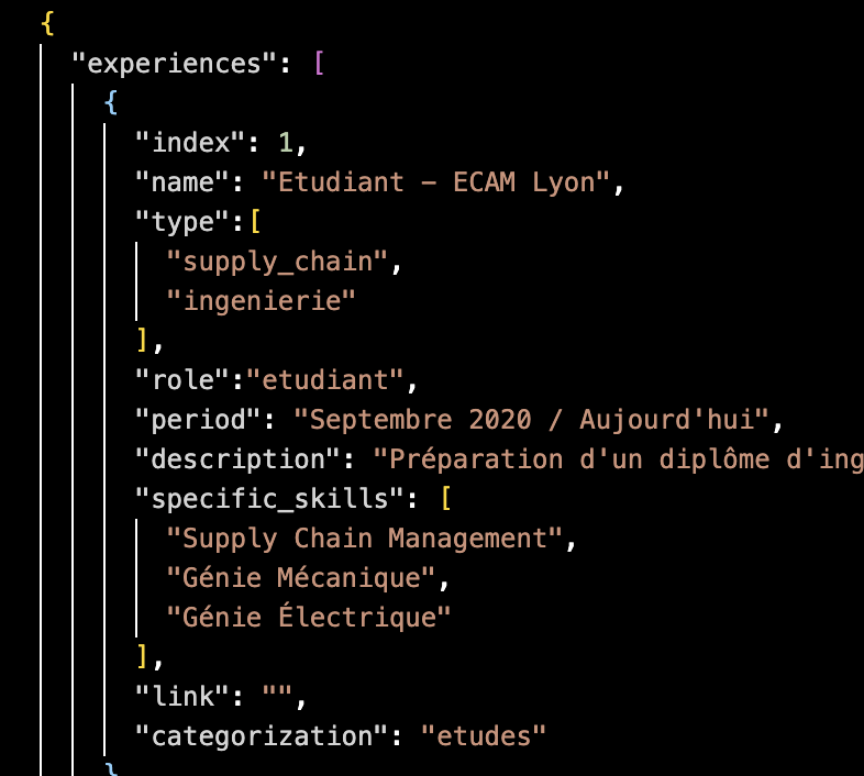
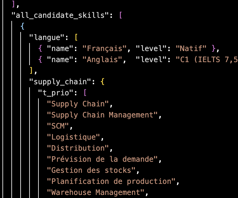
The cv.json file is the single source of truth for the AI. It contains all my experiences (indexed, typed by domain, with specific skills and categorization), a prioritized skills taxonomy organized into top priority, priority, and bonus tiers for both Data and Supply Chain domains, as well as my personal information. The AI reads this structured data to build every tailored application.
Step 3 — PDF Generation (ReportLab): For each offer scoring above the threshold (80/100), the system automatically generates two professional PDF documents: a tailored CV with photo, dynamically selected experiences, rewritten descriptions, and an offer-specific skills section, as well as a personalized cover letter. Each offer gets its own subfolder with all generated files.
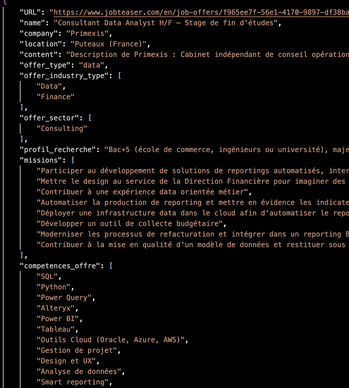
Here is an example of the enriched output for a single offer. The AI has classified the offer, extracted its missions and required skills, scored it against my profile, selected the best-matching experiences, and rewritten their descriptions — all stored in a structured JSON ready for PDF generation.
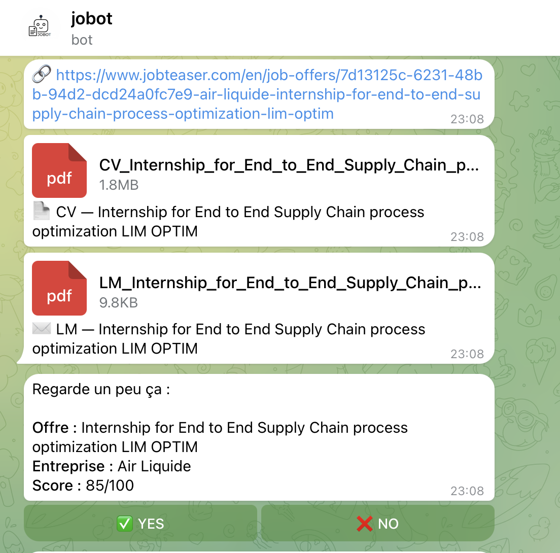
Step 4 — Telegram Notification (python-telegram-bot): All results are pushed to a private Telegram bot. For each offer, the bot sends the offer URL, the generated CV and cover letter as PDF documents, and an interactive summary showing the company name, offer title, and AI score out of 100. Each summary includes YES / NO inline buttons — I can review and approve or reject each application directly from my phone.
Here is the Telegram bot interface. Each offer is sent with its URL, the tailored CV and cover letter PDFs, and an interactive summary with YES / NO buttons for instant decision-making from my phone.
Step 5 — CI/CD Automation (GitHub Actions): The entire pipeline runs autonomously via a GitHub Actions workflow, scheduled twice daily (11:00 AM and 4:00 PM). The workflow sets up Python, installs all dependencies, pulls and caches the Ollama LLM model, runs the full pipeline, and uploads all outputs as artifacts. The model cache is persisted between runs to avoid re-downloading the ~2GB model each time.
The pipeline successfully processes up to 9 job offers per run, scoring and generating complete application packages in a single automated execution. The system has been running daily since February 2026, producing over 60+ complete runs with tailored CVs and cover letters for companies such as L'Oréal, CHANEL, Louis Vuitton, Deloitte, Allianz, Ferrero, Ubisoft, Wavestone, and Volkswagen — all without any manual effort beyond pressing YES or NO on Telegram.
The system requires zero daily effort: it runs entirely in the cloud via GitHub Actions with no local setup needed. The AI uses structured multi-step prompt chains with strict no-hallucination rules and JSON-only output. Every run produces timestamped output folders with full traceability — raw scraped data, enriched data, scoring results, match data, PDFs, and decision logs. The modular architecture (init → scraper → IA → PDF gen → Telegram → auto-apply) makes it easy to extend or replace any step independently.